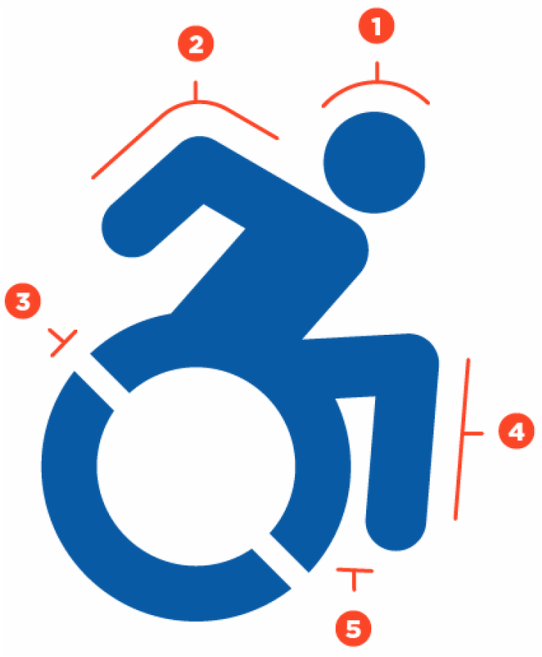
The Accessible Icon Project was the subject of the most recent episode of 99% Invisible, a podcast about overlooked design and architecture. I spoke at length to the super smart and thoughtful Lauren Ober about the project—its history and its aims—and I'm pleased that the show gave its famously perceptive treatment to the work.
As I've said before, there are invariably aspects of the project that end up on the cutting room floor; this is natural to journalism and to storytelling in general. Often what's emphasized about the icon project is the graphic itself—why it's different, and why we want to change it. Even with great story coverage like 99% Invisible's, that emphasis starts to sound a lot like efforts to "rebrand" the icon—and I've increasingly heard the work described as such. I'm against that language for a bunch of reasons, and I want to explore why. 
As I've said to every media producer who's written about the project, we weren't the first ones to re-imagine it, and we've never claimed otherwise. We've never even been *interested* in "firstness." The project's very origins were in casually collecting old and newer versions of the icon—ones I'd see by chance in the built environment in various settings, like this:
The project has had a social aim from the beginning. Yes, we delivered a new graphic design, but it was the publicness and the action around changing signage—and all the objections and skepticism that we got along the way—that have yielded the restless and unfinished conversation I consider to be the living pulse and grounding of the work. It was a social set of actions, starting with this image below—the image that still feels to me like the strongest representation of the project.
It's precisely the un-resolve of this image that makes it interesting—and impossible to harness as a brand identity. Brands are about graphic logos that "pop," about memorability by association, about using a clear and wholesale repetition that creates a smooth transition to new and clean idea, devoid of friction. I think we were right to end up with an image that could be distributed widely and used as a new icon—the one that begins this post. But the graphic is not the destination of the work. The destination is a thousand invisible—and, I hope, eventually visible—acts of structural and cultural change: in global rights, in abuse prevention, in meaningfully inclusive schools and workplaces.
Now—naturally—I've asked myself multiple times whether it's not ultimately better to fall in line with a marketing mentality: If it gets more people aware of and interested in the ideas at the heart of the project, then why not? Shouldn't a clarity of vision, a smoothness—the opposite of that friction—characterize the change we want to see in the world? The problem, I think, is the tendency of marketing logics—when applied to enormous, complicated issues like disability rights—to yield merely placebo politics.
That's the term artist Benjamin Bratton used in his piece in the Guardian decrying another kind of smoothness: the TED platform's strict and scripted narrative form, almost irrespective of the topic, pointing toward "tidy and just-so solutions" to the world's most intractable problems.
Bratton isn't the first to diagnose TED's shortcomings: its breathless worship of technological Disruption and Innovation and the rest. But he's the first to challenge its willingness, on the one hand, to justifiably exclude "placebo science" and "placebo medicine" from the list of acceptable talk subjects—while refusing to look critically at the "placebo politics" it lauds as "game-changing," revelatory socio-political ideas. Here's Bratton:
The key rhetorical device for TED talks is a combination of epiphany and personal testimony (an "epiphimony" if you like ) through which the speaker shares a personal journey of insight and realisation, its triumphs and tribulations.
What is it that the TED audience hopes to get from this? A vicarious insight, a fleeting moment of wonder, an inkling that maybe it's all going to work out after all? A spiritual buzz?
I'm sorry but this fails to meet the challenges that we are supposedly here to confront. These are complicated and difficult and are not given to tidy just-so solutions. They don't care about anyone's experience of optimism. Given the stakes, making our best and brightest waste their time – and the audience's time – dancing like infomercial hosts is too high a price. It is cynical.
Problems are not "puzzles" to be solved. That metaphor assumes that all the necessary pieces are already on the table, they just need to be rearranged and reprogrammed. It's not true.
If we really want transformation, we have to slog through the hard stuff (history, economics, philosophy, art, ambiguities, contradictions). Bracketing it off to the side to focus just on technology, or just on innovation, actually prevents transformation.
The hard stuff—friction, a willingness to embody and suspend un-resolve—these are essential to making the icon count for rights, for substantive change. I remain against re-branding, and eagerly look for the messy, hard slog of change to come.