
Update: This work now has a life of its own: the Accessible Icon Project, and we've been getting some super press coverage lately. See stories on FastCo, Print/Imprint, among others. More to come!
In 2010, after this early post where I started comparing and collecting old-and-new images indicating wheelchair accessibility, my collaborator Brian Glenney suggested we create something like a stencil to alter existing signs—something that would involve spray paint, since he's done a lot of graffiti.
After a number of conversations, we created this first prototype, as some of you have seen in this post. No paint, but a sticker:
But we knew it wasn't quite right. I kept working, drawing various possible figures, and we debated the best form suited to the intervention: Should it cover over and completely replace the old icon? Would it be a magnet, or a decal? What were we hoping to accomplish?
Over the year, I've kept tabs on all the many human icons that exist in our everyday signage, and I'm always astonished to see how animated and evocative these signs can be:
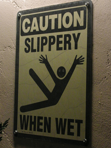
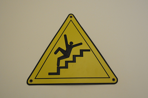

(This last image is from Julia Turner's fascinating look at signage and its usage—a great long read on Slate. And here's a link to the Flickr set called Stick Figures in Peril—some 22,000 strong)
If these images can be so simple, elegant, and active, why is the standard wheelchair-user represented in such wooden, static form? Wheeling a chair is often a very physical activity—but this visual has the person synonymous with the machine:
When creating our new prototype, I fought hard to see the old image underneath. There was something tempting, of course, about the idea of a wholesale re-design—just slap it on, and change the entire message. But I liked the deliberation in evolving the icon instead. I wanted to draw attention to the old image (since it's one of those that's at once familiar and utterly forgettable)—and to suggest its becoming something else.
And then I stumbled on MONU journal, whose current call for submissions named this very thing I'd been vaguely insisting on. MONU's claiming that it's urban editors, rather than urban planners, who are at work making our built environment. Freed from the grandiose mandate to create new utopias, replacing old with new, architects and planners of all kinds will be charged instead with "selecting, correcting, condensing, organizing, or modifying the existing urban material."
Hence:


All wheelchair photos mine; other signage photo credits: 1, 2, 3, 4